Web Design Trends: What We’ll See More of in 2024
Table of Contents
Web design is something that’s constantly changing.
As user interests and behaviours evolve and new tech and software emerge, so do new web design trends.
Some of these web design trends end up being novelties, some cycle in and out of fashion over the years, and some even become a staple for what a great website looks like.
Now that we’re in 2024, we wanted to highlight some of the main web design trends we’ll see more of this year, other trends that we’re hopefully starting to see the end of, and how often you need to worry about changing your web design.
Let’s get into it! 👇
How often do web design trends change?
While new web design trends appear pretty frequently, the fundamental principles of web design tend to stay the same; so don’t worry about having to update your web design every five minutes.
The big problem that some brands have is they jump on hot web design trends and focus their entire website design and structure around it.
Eventually, when the trend dies out (as many web design trends do), they’re left with an out-of-fashion website that will cost them a tonne of time and money to redevelop.
Nail the fundamentals before jumping on web design trends…
As a web design agency of almost two decades, we know that the key to a successful website design is to create a baseline design that consistently follows fundamental web design and UX practices.
Once you’ve nailed the fundamentals, then you can start experimenting with new and relevant web design trends to see if they work with your audience.
The fundamentals rarely change. So, when you design and build your website with those fundamentals in mind, you’ll find it much easier to make amendments and redesign pages later.
5 web design trends we’ll see more of in 2024.
1. More focus on UX design
While only 55% of companies actively carry out UX testing and optimisation on their websites, that figure has been steadily growing over the last 10 years, and it looks like it’s going to carry on that way.
More businesses and brands are starting to pay attention to how people think and feel when using their websites, and all the fancy features and AI tools in the world won’t help a website perform well if the core experience is fundamentally flawed.

If you want people to stay on your website, engage with pages and content, and ultimately complete a conversion action, providing a great user experience isn’t just an option; it’s a necessity.
It’s not about having flashy features; it’s about creating a website that is easy to use and meets your users’ needs and expectations.
As more tech and AI tools emerge, the growing web design trends surrounding user-centric design are a reminder that, no matter how advanced those tools get, understanding and caring about what people want to see on your website is essential.
2. AI-generated images instead of stock images
One of the worst web design trends is the overused, cheesy stock photos people put on their websites.
But with generative AI tools like Midjourney and Adobe Firefly allowing businesses to create unique, relevant images with just a brief description and a couple of clicks, we should start seeing less of this over the coming years.

It’s easy to understand why some businesses use standard stock images. They’re cheap (sometimes free), easy to access, and you don’t have to spend time and money getting professional quality photos done (or buying the equipment to do it yourself).
But the problem with using stock photos like the one below on your website is that hundreds, if not thousands, of other websites are using them, too.

These images are so overused that they can give your website a tacky and unprofessional feel, and obviously, that’s something to avoid.
If you can’t take quality photos yourself, try using some generative AI tools to create images instead.
With some of these tools allowing free access, it’ll be more cost-effective than using the same old, boring stock images, and you’ll get something unique, too.
A word of caution, though: don’t use AI tools to create all the imagery and visual designs across your website. There still needs to be some human input from an experienced designer who understands the ins and outs of creative design.
3. Interactive experiences and storytelling
Another one of the web design trends we’ve been seeing more of over the last few years is websites that use interactive elements and storytelling to engage their users.
These brands focus on creating more of a digital journey rather than just a standard website.
Instead of just presenting information, these websites get users to participate and explore different interactive features that deliver information, like clickable images, reactive animations, and elements that respond to the users’ actions.
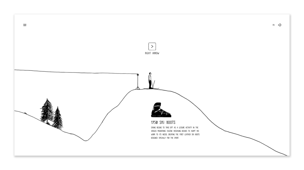
Like this website that explains the history and origins of French shoe brand Heschung.

While they’ve got an online store like most other shoe brands, Heschung hasn’t just gone the route of an ‘About us’ section.
Instead, they’ve worked with an illustrative artist to create an interactive website that shows their journey from a humble shoemaker in 1934 to making shoes for French Olympic skiers and beyond.
Telling stories, not just displaying information…
Storytelling also plays a big role in creating connections and deeper interest levels with audiences.
Most website copy out there is dull, full of jargon, and only focuses on promotion. But more brands are getting talented copywriters involved in their website processes to create written content that users can’t help but keep reading.
The reason interactive experiences and storytelling are taking off is because they create emotional connections with users and make websites more memorable.
People enjoy feeling more connected and involved, and they don’t want to read through cold, salesy website content.
These interactive, story-led experiences help bring a human touch to websites, and I’m sure we’ll see more designers creating these types of experiences this year.
4. Parallax scrolling with video backgrounds
Parallax scrolling designs aren’t new; they’ve been used for over 10 years.
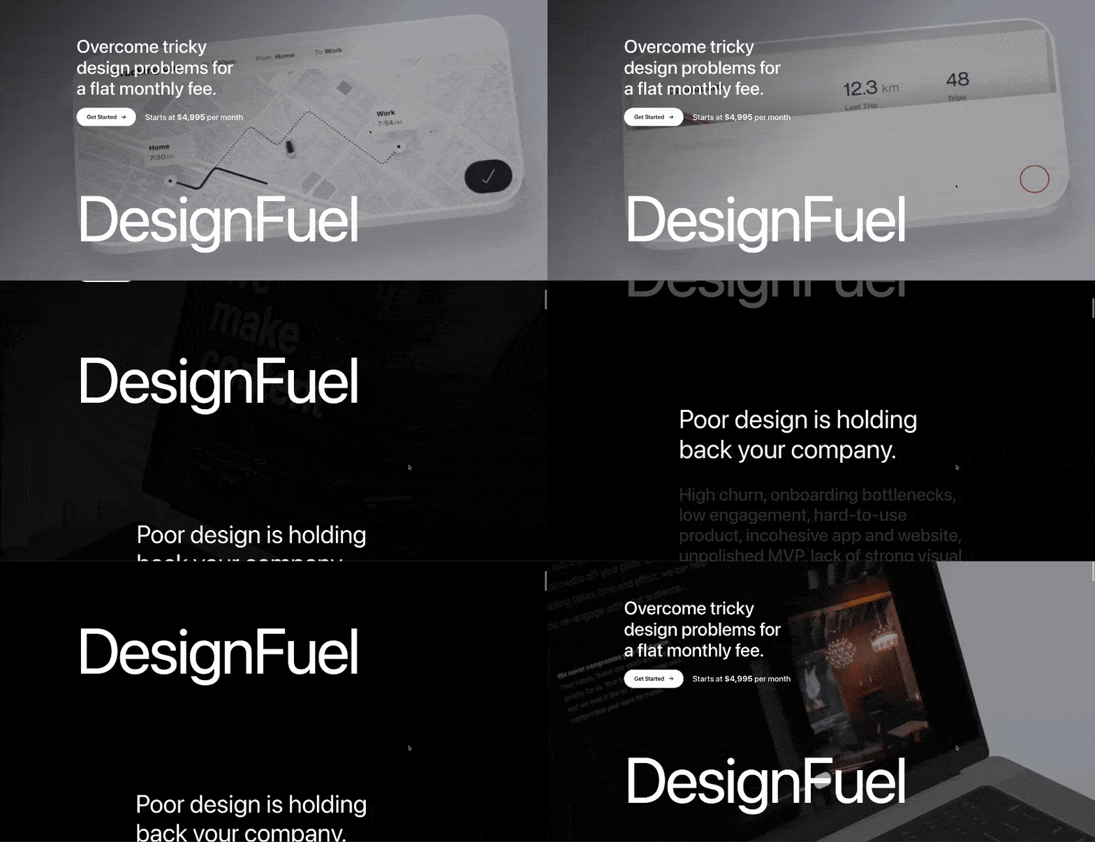
If you’re unfamiliar with the term, parallax scrolling is where background images move slower than foreground images when a user scrolls down or up a web page – it looks a bit like this. 👇

More recently, there’s been a trend of more websites using video backgrounds in combination with parallax effects to elevate the visual experience of their websites – like this on the DesignFuel website.

But the thing with parallax scrolling is it’s often overused by brands that don’t need to use visual elements like this.
If you’re in a very visual industry, like interior design or artwork etc., then you should absolutely be using elements like this in a few relevant places on your website.
But if you offer standard services like accountancy, you don’t need fancy parallax scrolling elements to embellish your service pages.
But parallax scrolling isn’t great for accessibility…
Another issue is the accessibility side of things.
While parallax backgrounds can look great, the motion involved isn’t very friendly for people with vestibular disorders (like Vertigo), especially if they take up a lot of space or are positioned behind pieces of text.
For that reason, we tend to lean away from parallax scrolling elements at Damteq; however, when used sparingly where it adds visual value with accessibility in consideration, they can make a great addition to your designs.

Want a website that looks great and drives business growth?
We’re one of the web design agencies in Hampshire, and with a deep knowledge of human behaviour and business growth, our team of specialists create websites that people love using and help improve marketing performance.
All of our websites are built from scratch with no templates or off-the-shelf themes, so you know you’re getting a completely bespoke website tailored to your business.
Oh, and with our SEO team also involved in web projects, they rank well on search engines too!
Want to learn more? Get in touch with one of our Specialists!
5. Compartmentalised designs
Some web design trends like this aren’t caused by changes in behaviours, needs, or technology. Some are just designers becoming more aware and considerate of human psychology.
People like order and clarity. If your website doesn’t deliver that, then your users aren’t going to stick around, are they?
Some sites with messy content structures, no section breaks, and big walls of text make it hard for users to digest pieces of content quickly.
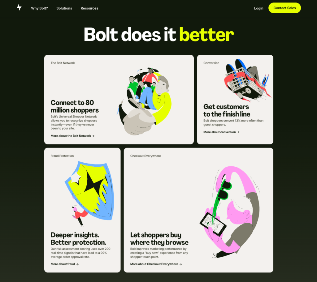
But over the last few years, we’ve seen more websites compartmentalising their written content, images, and calls to action to create a clear, consistent layout that’s easy for users to understand using ‘bento grids’.
Like this example on Bolt’s website.

In some cases, these compartmentalised designs are used in a few sections on the page, and in others, content compartments create the entire website structure.
5 web design trends you need to avoid.
1. Using image carousels
Despite so many websites still using image carousels, more people are realising how bland they can be and how useless they are for engagement.
Notre Dame University did some testing on image carousels back in 2013, and they found that manual image carousels (carousels that you have to scroll through manually) only had a 1% click-through rate.
What’s more, almost 90% of those clicks go to the first slide on the carousel, which means any additional slides that must be scrolled manually are fighting over a measly 0.1% click-through rate between them!
While this research was carried out a while ago, it’s still relevant today and matches similar data from our UX specialists while auditing and testing websites.
Sure, carousels are a neat way of including multiple images into a single area of a webpage, but they get next to no engagement.
Thankfully, over the last decade, we’ve seen fewer image carousels being used on websites, but some are still holding onto them for dear life.
It’s certainly time to let web design trends like this one go!
2. Overusing generic stock images
As I mentioned earlier in this post, cheap stock images that get overused are something to avoid.
They are often over-the-top, dramatised, or meaningless images that people slap onto their web pages to break up content.
I mean, just look at the state of these images here.
The guy in this photo seems to be making over-the-top facial expressions to something he’s hearing on his call… except his headset isn’t even plugged in.

And this ‘vision’ one is just awful. There are countless stock images like this, with random terms and buzzwords spelt out with Scrabble tiles with zero context. Just why?

Using the same stock photos as everyone else is one thing, but using stock images that are inauthentic and poor quality will make your website feel cheap, unprofessional, and generic.
If you want to use more images across your website, make sure they’re relevant and original (or at least not widely used) and provide additional value to your content or the overall user experience.
3. Adding too many animations
This is one of the common web design trends for websites built on platforms like GoDaddy and Wix, and it can kill your website’s SEO and UX.
Animations should be used sparingly and only in places where they add visual value, such as when a web page first loads, with the main title and subtitle fading in.
Some websites completely overdo it, though, creating a pretty shocking user experience.
If every heading, image, and piece of body text is animated on your pages, it’s just overkill, especially if you’re using loads of different animations.
You don’t need animations to jazz up your website; your content and value proposition are what you want to ‘wow’ your audience.
Too many animations can kill your site speed…
Using too many animations can tank your website speeds, too.
Each animation will have a line of code to trigger it once the page loads or the element comes into view. All that extra code across your website can drastically increase the time it takes pages to load, which is frustrating for users but also very bad for SEO.

If you’re using animations sparingly and for interactive elements that add value to the user experience and have a minimal impact on page speeds, then by all means, crack on.
But if you’re using animations just for the sake of it, you’ll be doing more harm than good.
4. Designing for desktop viewing only
If your website is only accessible or displays correctly on desktop computers and laptops, you could lose half of your potential visitors.
As mobile phone usage has continued to increase over the last decade, the amount of online traffic attributed to these devices has also increased.
Despite over half of all searches being made using mobile devices, so many websites still prioritise desktop viewing and ignore mobile design and UX.
If you’re not prioritising your website’s design and UX on mobile, that’s definitely something to look at this year.
5. Adding website loading screens
Showing a loading screen when people first click on your website or navigate between pages isn’t a great look for your business and makes your website seem unprofessional and outdated.
When someone clicks on a link to your website, they want to be taken to it immediately. They don’t want to sit there staring at a bland, often poorly-designed loading page like this one.

If you leave users on these loading screens for more than a couple of seconds, the chances of them leaving and going elsewhere will increase massively.
If your pages load so slowly that you need loading screens, your focus should be improving your site speed, not on a quick patch-up like adding loading screens.
If you use loading screens to counteract images loading in after written content, you can use lazy-loading images instead.
Lazy-loading images will replace large images with a blurred version until the image comes into the user’s view, at which point it will load the full version. Implementing lazy-loading images will help improve the page loading speeds across your website and the overall user experience.
Final thoughts.
While the majority of web design trends we’ll likely see more of this year revolve around the user and creating more engaging and seamless experiences, as AI continues to grow and evolve, I have no doubt that it will play a bigger role in design as the year goes on.
As for the web design trends that we’ll hopefully see the back of in 2024, as businesses gain a better understanding of design, user experience, and human psychology, many of these will continue to decrease over time.
Something that definitely isn’t going anywhere though is the human touch that’s needed in your website design.
Remember that your website is made by people, for people. So you can’t expect AI to create pages, content, and images that will spark the same interest and emotion as human-created content.
With more and more businesses automating their online platforms, be the one that doubles down on a people-focused design and experience for your users.
