Having a clean and functional ecommerce web design is absolutely essential if you want to sell your products online.
The problem is when most people hear the word ‘design’, they think about just the visual side of their websites, and while visual design is a crucial factor, there’s much more to ecommerce web design than that.
Even if your website looks fantastic from a visual standpoint, without considering factors like functionality, responsiveness, User Experience (UX) and Search Engine Optimisation (SEO), then you’ve just got style and no substance.
In this blog post, we’ll explore some of the ecommerce web design practices and how you can improve your design to get more engagement and sales through your online store.
The main areas of ecommerce web design
First, I want to talk about what areas of ecommerce web design you need to consider when improving your online store.
See, too many brands just focus on the aesthetic side of things, and while visual design is super important, it’s not the only thing to focus on.
A great website design can be broken down into three main areas:
- How the website looks (aesthetic design and styling)
- How the website performs (features and functionality)
- How the website guides users (UX design)
Aesthetic Design
How your website looks can have a massive impact on how people perceive your brand and the level of trust your customers place in your business.
Creating an aesthetically pleasing design with clean product page layouts, high-quality and relevant images, and consistent use of your branding helps to create a more positive perception of your brand and the products you sell.
On the flip side, if your ecommerce web design is messy, cluttered, or just a visual nightmare, it doesn’t matter how great your products are; you’ll most likely be missing out on a lot of potential sales.
Functionality
It’s not all about how your website looks; it’s also about how well it works.
Great functionality is essential for getting sales through your ecommerce website. This means implementing all the features and functions your customers would expect to see, like sorting and filtering options and a smooth and simple checkout page, as well as optimising page performance and mobile responsiveness.
So many websites focus on style over substance. But great functionality is the key to improving customer experience and getting more engagement, sales, and repeat customers.
User Experience Design
Creating a positive user experience on your ecommerce website is the key to retaining visitors and turning them into paying customers.
Offering a smooth and roadblock-free user journey that naturally guides your potential customers to well-placed and relevant calls-to-action and product offers will help you see more engagement and conversions through your online store.
How ecommerce web design influences sales
Now, let’s talk about how ecommerce web design plays a huge role in building and retaining user interest and trust, which can significantly impact your website sales.
How great ecommerce web design increases sales
A well-designed ecommerce website streamlines the browsing and purchasing process, making it easy for users to find products, navigate the site, and buy things.
Intuitive navigation, clear product descriptions, and effective search and filtering options improve user satisfaction and encourage users to explore more pages. In contrast, a well-crafted user experience guides them towards converting.
Also, visually appealing design elements and consistent branding can create a positive first impression and reinforce your brand identity, which helps build trust with your potential customers.
How bad ecommerce web design harms sales
Cluttered layouts, confusing navigation menus, and a lack of mobile optimisation can frustrate your website visitors, leading to higher bounce rates and abandoned shopping carts, and a lack of clear calls-to-action and poorly structured product pages can often lead to fewer sales and returning visitors.
In short, if your website is messy, complex to use, and does nothing to promote user trust or action, then you’ll struggle to generate sales.
Tips for improving your ecommerce web design
Make your product categories easy to understand
Product category structure is a huge part of ecommerce web design.
When structuring your product categories, make sure you’re doing it logically and in a way that will make sense to your customers, like this example of one of our client’s websites.
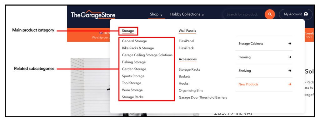
Use clear and descriptive category names that align with your customer’s expectations, and avoid using overly complex subcategories. Too many subcategories can confuse your customers and create a messy user journey.
Instead, you can make your products easy to find by adding sort and filtering options, reducing friction and user frustration.
Creating a simple and logical structure for your product categories will help remove roadblocks from the customer experience on your website, resulting in fewer user bounces and missed sales opportunities.
Creating compelling product page designs
Great product page designs lead to increased user trust and more sales.
The problem is that many businesses don’t put enough effort into their product pages. They throw a few grainy images, a short list of product specs, some prices, and a bog standard ‘Add to cart’ button onto a page and expect their products to start selling.
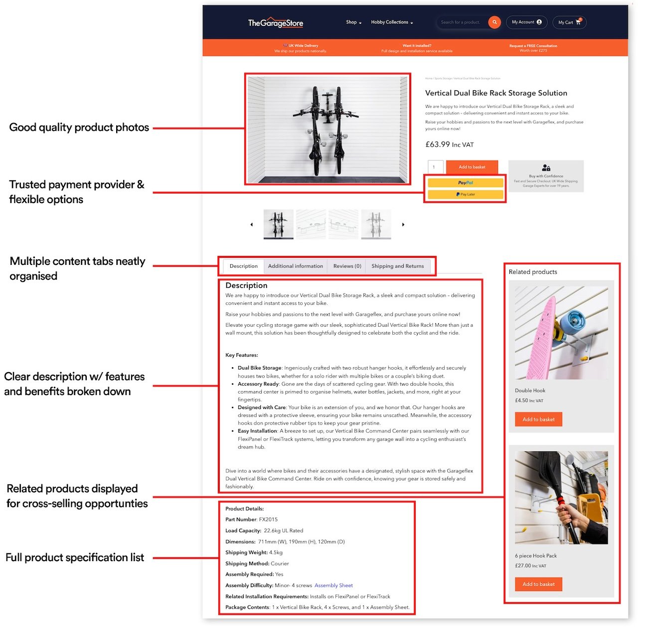
If you want your produce pages to hold user interest and encourage them to buy your products, you’ve got to include:
- Compelling, benefit and feature-focused content
- Consistent visual branding and tone of voice
- Social proof, e.g. customer reviews/Trustpilot ratings
- Trust markers, e.g. product awards and trusted payment methods
Adding more content to your product pages that explains your products’ key features and benefits will help encourage customers to take action, and that content will also be great for your SEO.
Here’s a great example of one of our ecommerce web design clients that opted for a simple layout, but packed it with info and content about their products.
Streamline your checkout process
The shopping cart and checkout sections of an ecommerce website are often where the most user friction happens.
I’m sure you’ve come across a website with a bad checkout page before, right? They drag out the process across multiple pages and force you to create an account, but then something goes wrong with their system, and you have to start all over again.
At which point, you likely just give up and find another product or website.
To stop that from happening on your ecommerce website and reduce the number of users that abandon their carts, make sure you:
- Show all the information customers need in a summary (products in the cart, subtotal, shipping costs, VAT, etc.)
- Display all of the payment methods you accept on the cart or checkout pages
- Don’t ask for more information than necessary in your checkout forms
- Give customers a ‘guest checkout’ option instead of forcing them to create an account
- Carry out snag testing to make sure the checkout forms and process works properly without any errors
We’ve seen our fair share of bad checkout pages and the impact they can have.
Quite a few times, we’ve had businesses reach out to us, complaining their website doesn’t generate sales and they need a new one. However, when we look at the data, we can see that their website is getting consistent traffic and engagement, but their cart abandonment is through the roof.
We hand it over to our UX specialists to do some in-depth auditing and tweaking, and, low and behold, they start getting sales.
Remember your checkout process is the final hurdle customers have to go through before buying. Even if the rest of your website is spot on, if your checkout pages aren’t working as they should, it can tank your sales.
Add filter and sorting options
Filtering and sorting options for your website are an absolute must.
If your product subcategories have dozens or even hundreds of products, a filter/sort feature will allow your customers to find what they’re looking for quickly and easily without having to scroll through your entire list of products.
This Amazon search is a great example, with loads of different filtering options to help people find products that match their wants and needs.
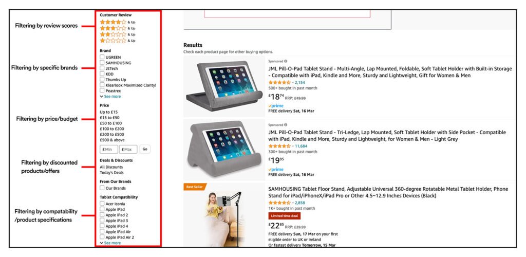
You can set sorting and filter options for things your users would expect, like:
- Product type
- Price (low to high)
- Price (high to low)
- Brand
- Size
- Review rating
You can also create custom sorting options if your products have other features or criteria your customers might want to sort through.
Just make sure the feature works properly and filters products accurately. If the feature is broken or inaccurate, it can cause a lot of frustration for your users.
Don’t overuse pop-ups
Overusing pop-ups on your ecommerce website can detract from the user experience and reduce user engagement and conversions.
Excessive pop-ups disrupt the flow of your website’s user journey and can be frustrating for your users. If they’re bombarded with constant pop-ups when browsing your products, they’ll likely give up and look elsewhere.
To make your website pop-ups effective, there are two things you need to think about – timing and relevance.
Let’s start with timing.
Focus on placing pop-ups to appear when they are less likely to interrupt the user journey, like when they’re about to leave your website (see example below) or have been on the same webpage for a long time. This is far less intrusive than pop-ups appearing the second someone lands on your website.
Your pop-ups also need to be relevant to your users’ interests too.
Don’t just throw around generic offers or promotions; create page-specific pop-ups relevant to the products people are actively looking at or tailor them to each user’s behaviour and interests.
For example, you could offer a discount code for a product a user has in their basket.
Pop-ups can be a great tool for increasing conversions and reducing bounces on your website. But remember to be careful with where and how often you use them!
Follow web design best practices
Like any other website, following these best practices when designing your ecommerce website is essential.
Mobile design and mobile performance
Over 60% of all ecommerce sales come from mobile devices. So, if your ecommerce web design doesn’t work smoothly and consistently on mobile, tablet, and desktop devices, you could be missing out on a lot of sales.
Make sure you’re using a website platform with responsive design tools and features, or reach out to an ecommerce web design agency to look at this for you.
Don’t forget about mobile page speed and performance either.
If your pages take too long to load on mobile devices, or if important features don’t work as they should, it can have a big impact on your mobile user experience.
Clear navigation
Your navigation menus play a vital role in helping visitors find what they’re looking for quickly and efficiently.
An intuitive and well-organised menu structure makes it easy for your customers to find what they’re looking for and reduces user frustration and cart abandonment.
If you make your website easy to navigate, visitors will be more likely to stay on your website, browse multiple pages, and buy from you.
Consistent branding and structures
If pages on your website are structured differently or use different branding styles, it can create a confusing experience for your visitors.
Consistency is key to creating a clear and easy-to-navigate website experience and making your brand recognisable.
Being consistent when creating page designs and structures and using your branding is important for creating a cohesive and professional appearance across your ecommerce website, and it helps reinforce your brand image.
Ecommerce web design FAQs
How does site speed affect ecommerce sales?
Site speed can have a massive impact on your website’s user experience and SEO performance, leading to lost revenue and sales opportunities.
If your website takes longer than a couple of seconds to load, the chances of your users leaving without buying something increase drastically.
If your ecommerce website takes around 4 seconds to load and has an average of 10,000 monthly users, you could be losing up to £250,000 in revenue a year compared to a website that takes only 1 second to load!
How often should I update my ecommerce website’s design?
There’s no specific time limit on how long your ecommerce web design will last.
How often your website’s design needs updating can depend on several factors, like industry trends, changes in user behaviour, and your needs evolving as your business grows.
Most businesses consider a major redesign roughly every 2 – 3 years. However, if your website was designed and built with a long-term strategy in mind, as long as you’re regularly updating your tools and plugins, adding new pages and features, and creating fresh and valuable content, your ecommerce website’s design could last much longer.
What payment gateways should I use on my ecommerce website?
The payment gateways you can use on your website depend on where your business is located, the countries you sell your products in, and the type of products you sell.
For most ecommerce websites, secure payment gateways like PayPal, Stripe, and Square are great options.
Depending on the type of products you offer and their prices, you could also look at integrating Buy Now, Pay Later options like Klarna of ClearPay to give your customers a wider choice of payment options.
How can I reduce abandoned carts on my ecommerce website?
To reduce the number of people abandoning their carts on your ecommerce website, you can minimise the number of steps in the checkout process (and offer guest checkout options), be clear on any additional costs like shipping and VAT, and display the logos of the secure payment options you provide, like PayPal or Stripe, to help build trust with your customers.
You should also explore remarketing campaigns to re-engage with people who have abandoned their carts.
Remarketing involves placing a tracking cookie on your website that collects data, including users who abandon their carts, which can be used on platforms like Google Ads and Facebook Ads to show your ads to those users who didn’t complete a purchase on your website.
The mix of optimising and streamlining your checkout process and marketing to people who have abandoned carts on your website will help recover lost revenue opportunities and increase your website conversions.
Need help with your ecommerce web design?
Our team of ecommerce web design specialists have over 17 years of experience in creating website experiences that drive sales and engagement.
To learn more about our ecommerce web design packages, get in touch to speak to a member of the team.


